
Man needs colour to live; it’s just as necessary an element as fire and water
Fernand Leger
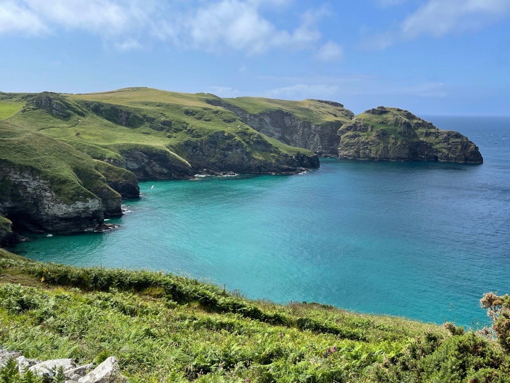
Summer here in the UK, and so far the weather has allowed everything to flourish spectacularly. We have had fields of bright yellow buttercups and grass that’s incredibly high this year.

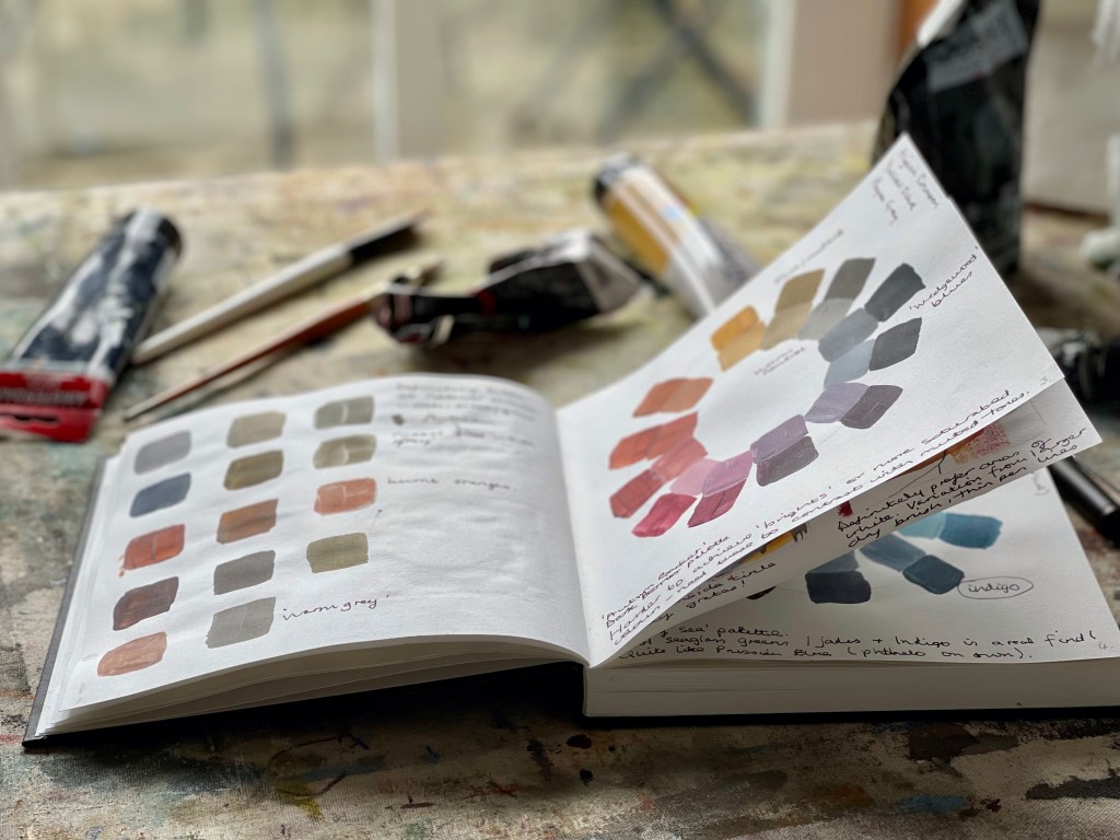
In the meanwhile, I’ve been enjoying the Festivities and some courses on painting and colour mixing. I’d like to develop more of my my own mixed colour and Louise Fletcher’s ‘Find your Joy’ taster course and The Colour Crush Creative Summit 2021 from Kellee Wynne Studios have both been really useful. I have to say the steady, logical exploration has been a relaxing exercise whilst I was on holiday and a change to the creative solution-finding that’s a different and rather tiring sort of thinking.


I now keep looking at things and hear myself saying ‘that sunset is cadmium red and yellow ochre’, or ‘that sea is a Prussian blue-green’… it’s actually very satisfying and I don’t really know why I haven’t looked at this before now. Just such a busy bee I suppose…
I’ve found some lovely greys and browns so I’m hoping my variety of paint colours can now lessen as I understand a bit more about getting the colours I want. My sketchbook isn’t pretty but I’ve put quite a few hours in getting a better understanding of colour mixing.
All colors are the friends of their neighbors and the lovers of their opposites.
Marc Chagall

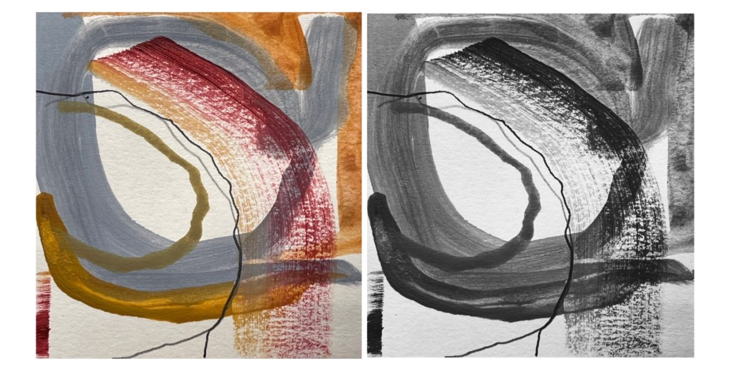
Probably the most valuable lesson has been variation or contrast. Using the black and white function on photo apps on tiny painty bits has helped see this a bit better: it’s just something I’ve never really explored and is about time I did.

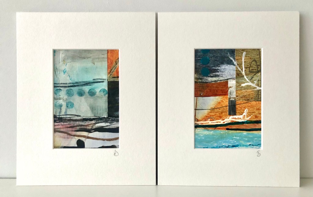
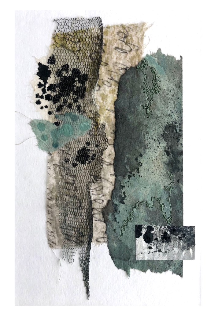
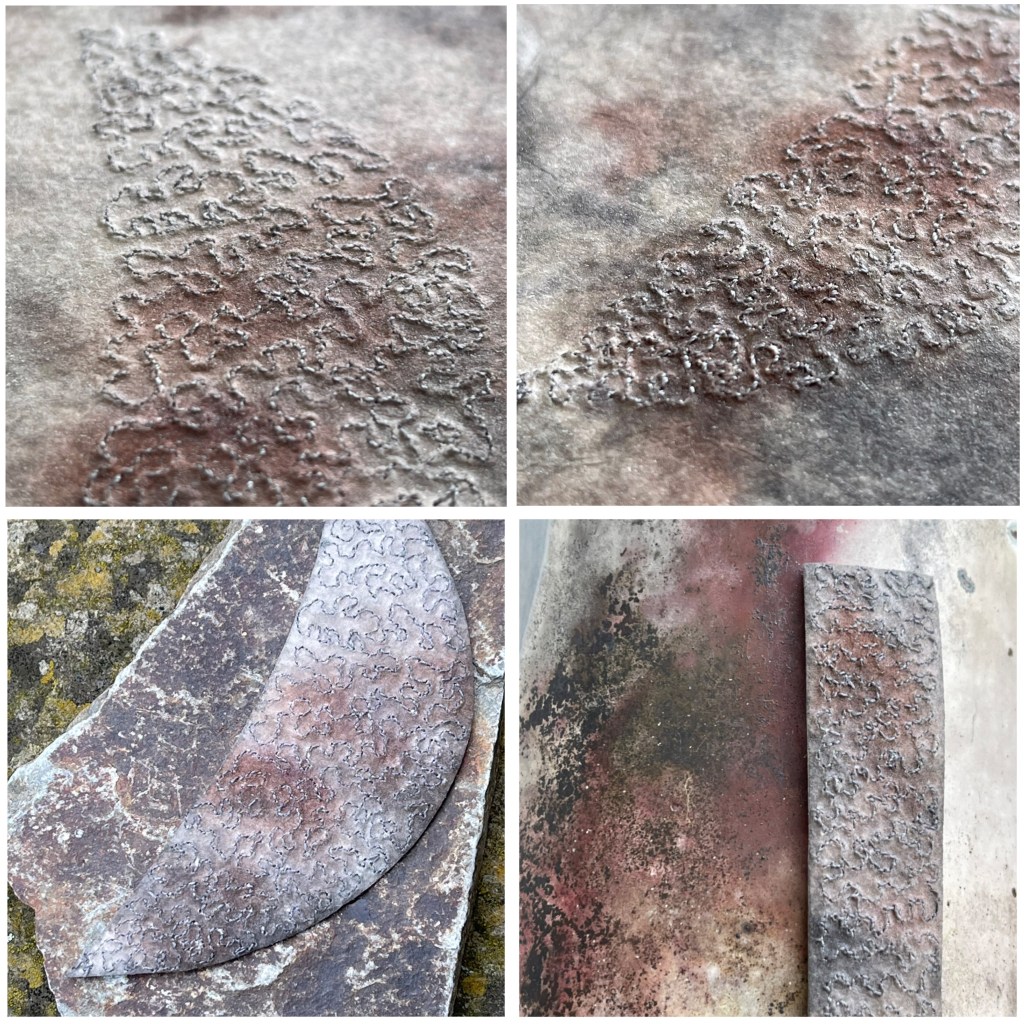
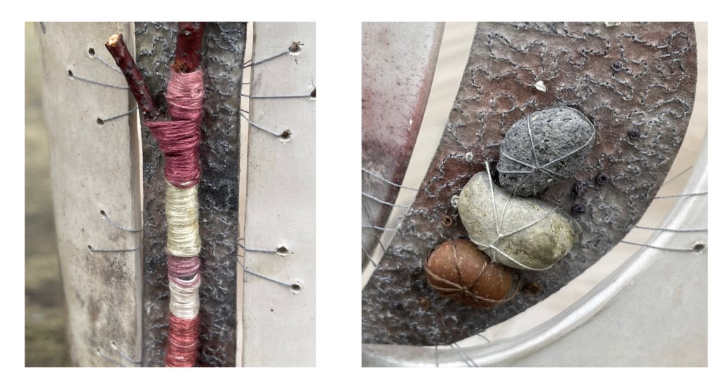
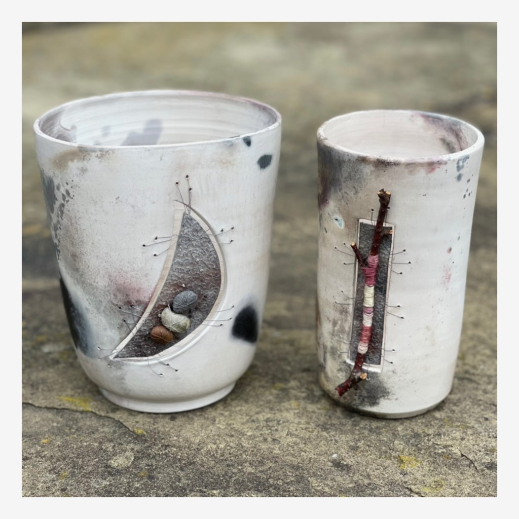
I’ve also been thinking about more muted colours in a collaboration with Martine Becquet who makes wood-fired ceramic vessels; responding to the colours of the smoke to create mixed media inclusions for the pots. These are being exhibited at the moment and we hope to work together more in future.
Some of the small abstracts will be on sale at Art at the House in September along with some larger pieces. There will also be a colourful riot of paper next to my stand for families to have a go at creating bird’s nest bowls. Do come along if you are local to Kirklees, there are a lot of artists to meet, work to buy and activities to try. There will also be details of a couple of workshops I’m hoping to put on in the Autumn.
But for now, the one thing I need to work on is my Arts Council sculpture and that doesn’t need any colour at all! It’s all about texture. So time to put some of this away and knuckle under for a bit.

Thanks to you I now look at stone and textures in everything with more awareness – now I hope to start exploring the differentials of colour in more detail too!
Ah, thanks!! Look forward to comparing notes 😊
I think your sketchbook is fascinating and I like the quote from Chagall! I have been looking at the colour wheel recently to advance a project – not yet found the answer but am enjoying the search. Changing photos of fabric into grey tones is a really useful tool too. Thank you for your ‘holiday postcard’ which reminded me of a happy afternoon spent at Boscastle many years ago.
Thank you! Yes, love it there. Hope you find your answer in due course.